We have been lied to about Global Warming, but WHY?

  • Christian Chat is a moderated online Christian community allowing Christians around the world to fellowship with each other in real time chat via webcam, voice, and text, with the Christian Chat app. You can also start or participate in a Bible-based discussion here in the Christian Chat Forums, where members can also share with each other their own videos, pictures, or favorite Christian music.

    If you are a Christian and need encouragement and fellowship, we're here for you! If you are not a Christian but interested in knowing more about Jesus our Lord, you're also welcome! Want to know what the Bible says, and how you can apply it to your life? Join us!

    To make new Christian friends now around the world, click here to join Christian Chat.
Here's a scientific paper that debunks your assertions. Looking at surface air temperature only (as per your graph) misses about 90% of the climate data for warming, even if that graph is accurate (which I doubt).

http://www.pas.rochester.edu/~douglass/papers/PLA_21192_proofs_plusFigs1_2.pdf

Read that, please. A snippet:

There has been considerable interest in whether Earth has beenwarming or cooling in recent years. Many studies show that theglobally averaged surface temperature has been “flat” or decreasingsince 1998. For example, in a recent study Kaufmann et al. [1] state“. . . global surface temperatures did not rise between 1998 and2008”. Using surface temperature as the best indicator of warminghas been questioned by Pielke [2,3], who says “Unlike temperatureat some specific depth in the ocean or height in the atmosphere,where there is a time lag in its response to radiative forcing,no time lags are associated with heat changes, since the actualamount of heat present at any time is accounted for. Moreover,because the surface temperature is a massless two-dimensionalglobal field while heat content involves mass, the use of surfacetemperature as a monitor of climate change is not accurate forevaluating heat storage changes” [3]. In our treatment, this takesthe following form: ocean heat content (OHC) has a direct relationshipto Earth’s radiation budget, whereas surface temperature doesnot. In paper [4] we quantified this relationship and tentativelyidentified three recent abrupt changes in the implied radiation imbalance.We argued that each of these changes was correlated witha climate shift (CS) that had been identified independently

Wow, it's pretty clear you're out of your depth here. Let me guess:

1. Read my assertion
2. Google it
3. Cut and paste supposed debunking.

I will not run around debunking your cutting and pasting, as I said before, once I do, you'll then never mention it again and go on to something else. By the way, according to the true believers Pielke = denier.
 
Mean surface air temperature at a given point does not account for the entire global mean temperature, however, air surface temperature, as per the data when zoomed in, is on a small increase (relative to seas and such) as I showed from past graphs.


It is their data, misrepresented by reframing the focus out from the frame in which it shows actual variation. It is rendered unreadable to any discernable degree as an effort to tranquilize the usefulness of the graph. It's dishonest. If it had been what GISS, as climate scientists, decided represented the data, they'd have represented it as such. It took for someone else to do it, who clearly isn't a climate scientist.


Again, surface air temperature represents less than 10% of applicable temperature data. Basing your conclusions on surface air temperature alone is kind of like having a computer with half a screen, no hard drive and a rock for a mouse. You're only seeing a small amount of the picture and it isn't useful in determining whether or not a global temperature shift is happening. Look at sea temperatures near the surface and in deep ocean. Look at stratospheric and atmospheric readings. Look at rainfall, sea levels, and all the rest of the data.

REALLY? Which temperature data sets would you like to use? Because you seemed to like surface data just fine 12 hours ago. Wait, I think I know where this is heading - we can't trust any ACTUAL data, we can only trust our altered data.

GWBS in a nutshell
 
Wow, it's pretty clear you're out of your depth here. Let me guess:

1. Read my assertion
2. Google it
3. Cut and paste supposed debunking.

I will not run around debunking your cutting and pasting, as I said before, once I do, you'll then never mention it again and go on to something else. By the way, according to the true believers Pielke = denier.

You just aren't getting it are you.

You assert that the graph you presented, showing surface air temperature increases, is a genuine representation of the surface air temperature changes. First off, yes, it does show the changes. However, it shows the changes on a scale of from 0-100 degrees celsius. We know already that the mean surface air temperature changes in the last 50 years are of less than one degree upwards, so they will look miniscule on a graph that shows a temperature range from freezing to boiling:

418335main_land-ocean-full.jpg


Your graph represents these figures on a scale ''zoomed out'' until we can see from 0 degrees celsius to 100 degrees celcsius. You use this particular representation of the graph to assert that global warming is insignificant, and this is dishonest in several ways:

1. It renders the information from GISS in a way that makes the temperature differences indiscernible.
2. It does not take into account that mean surface air temperature is only a small part of the entire warming picture
3. It fails to note that our ecosystem and climate system is finely balanced and global air surface temperature changes, even those of 0.8 of a degree have an effect
4. It fails to mention that temperature rises in oceans and in stratospheric and atmospheric readings are much more severe than the 0.8 degree temperature shift in surface air temperature
5. It fails to mention that average global temperatures on Earth have been historically, within a very narrow frame of reference MUCH SMALLER than the 0-100 degrees which you present in your representation of GISS' data.

What you're doing is intellectually dishonest. Now, I've given you a research paper that discusses this in great detail. You should read it.
 
REALLY? Which temperature data sets would you like to use? Because you seemed to like surface data just fine 12 hours ago. Wait, I think I know where this is heading - we can't trust any ACTUAL data, we can only trust our altered data.

GWBS in a nutshell

ALTERED? The data isn't altered in any way. It's just shown from a closer frame of reference, which is necessary when the variation is within a specific temperature range.

You obviously are not a scientist.
 
ALTERED? The data isn't altered in any way. It's just shown from a closer frame of reference, which is necessary when the variation is within a specific temperature range.

You obviously are not a scientist.

WHICH TEMPERATURE DATA SETS WOULD YOU LIKE TO USE? That was the question.

Or, better yet, here are your assertions:

1. The temperature rise we see IS an exponential increase
2. It's an accumulative problem (again inferring it's currently going on)
3. The increase will get faster

Please show me the data that shows these things to be true for the past 18 years. Oh, and no fair 'zooming out' any farther than that, it would be 'intellectually dishonest'.
 
WHICH TEMPERATURE DATA SETS WOULD YOU LIKE TO USE? That was the question.

Or, better yet, here are your assertions:

1. The temperature rise we see IS an exponential increase
2. It's an accumulative problem (again inferring it's currently going on)
3. The increase will get faster

Please show me the data that shows these things to be true for the past 18 years. Oh, and no fair 'zooming out' any farther than that, it would be 'intellectually dishonest'.

giss_temperature.png


Now, this represents -- let's see if you can actually understand this -- GISS' readings of mean surface temperature change within the last 130 years, within the graphical constraint of 1 degree celcius. So, if you take this data, showing the temperature change of slightly less than one degree over that space of time, and convert it into temperature readings rather than readings of temperature change values, and plot this data withina graphical constraint of 100 degrees celcius (rather than 1 degree celsius) it will look like this:

97652d1423849871-we-have-been-lied-about-global-warming-but-why-gw3.jpg


And by doing so, you'll be unable to discern ANY difference in temperature, because the graphical constraint is TOO LARGE TO SEE THE DIFFERENCE.

A mathematician would call the above graph's parameters too broad to be representative of the data set. We can CLEARLY SEE in the first graph that there is a temperature chang of about 0.8 degrees celcius over the time frame, but in the second one we cannot see the change, because the PARAMETERS are too large -- there is no honest reason to plot the graph on a scale that large. No time in recorded history has average Earth temperature been anywhere near 100 degrees, so why plot to 130?
 
Last edited:
I like how people believe Scientists are conspiring again them...by doing science...

but actual criminal conspiracies of rich corrupt men and politicians gets completely ignored.

It's so obvious the Bush family had ties to an inside job in 9/11, it's almost as if his father was convicted of financing the Nazis. Oh wait... he was...

But that all gets ignored.... because the Scientsts!!!

Wake up people, MONEY Talks in this world, and they are agitating for war for profit.
 
And, just for fun

You just aren't getting it are you.

You assert that the graph you presented, showing surface air temperature increases No it does not

is a genuine representation of the surface air temperature changes You might be wrong here, not sure - wording

First off, yes, it does show the changes. No it does not

However, it shows the changes on a scale of from 0-100 degrees celsius. No, it does not

Your graph represents these figures on a scale ''zoomed out'' until we can see from 0 degrees celsius to 100 degrees celcsius. Nope, we cannot see that

You use this particular representation of the graph to assert that global warming is insignificant CORRECT!

and this is dishonest in several ways No, it is not

1. It renders the information from GISS in a way that makes the temperature differences indiscernible CORRECT again
2. It does not take into account that mean surface air temperature is only a small part of the entire warming picture Oops, back to being wrong
3. It fails to note that our ecosystem and climate system is finely balanced and global air surface temperature changes, even those of 0.8 of a degree have an effect OF COURSE it has an effect, but that's not the issue
4. It fails to mention that temperature rises in oceans and in stratospheric and atmospheric readings are much more severe than the 0.8 degree temperature shift in surface air temperature It can't 'mention' anything, it's a graph. A graph by the way that SEVERAL times you claimed was 'altered' and incorrect. It is neither
5. It fails to mention that average global temperatures on Earth have been historically, within a very narrow frame of reference MUCH SMALLER than the 0-100 degrees which you present in your representation of GISS' data. Again, it can't 'mention' anything. By the way, what is your definition of 'historically'? Would that include the Medieval period?

What you're doing is intellectually dishonest. No, it is not dishonest. It uses GISS data to accurately graph ACTUAL global temperatures

That was actually kind of fun.
 
temperature readings rather than readings of temperature change values

YES!!! Good on you, mate. You FINALLY got it. Only took you 12 hours.

Now, back to business, since you finally see where you erred:

WHICH TEMPERATURE DATA SETS WOULD YOU LIKE TO USE? That was the question.

Or, better yet, here are your assertions:

1. The temperature rise we see IS an exponential increase
2. It's an accumulative problem (again inferring it's currently going on)
3. The increase will get faster

Please show me the data that shows these things to be true for the past 18 years. Oh, and no fair 'zooming out' any farther than that, it would be 'intellectually dishonest'.
 
I like how people believe Scientists are conspiring again them...by doing science...

but actual criminal conspiracies of rich corrupt men and politicians gets completely ignored.

It's so obvious the Bush family had ties to an inside job in 9/11, it's almost as if his father was convicted of financing the Nazis. Oh wait... he was...

But that all gets ignored.... because the Scientsts!!!

Wake up people, MONEY Talks in this world, and they are agitating for war for profit.

Please tell me more about this inside job. Me and my pet unicorn would love to hear more. Oh, and sign me up for a subscription to your newsletter.
 
YES!!! Good on you, mate. You FINALLY got it. Only took you 12 hours.

Now, back to business, since you finally see where you erred:

WHICH TEMPERATURE DATA SETS WOULD YOU LIKE TO USE? That was the question.

Or, better yet, here are your assertions:

1. The temperature rise we see IS an exponential increase
2. It's an accumulative problem (again inferring it's currently going on)
3. The increase will get faster

Please show me the data that shows these things to be true for the past 18 years. Oh, and no fair 'zooming out' any farther than that, it would be 'intellectually dishonest'.

This has already been addressed. The fact that the readings are of temperature change value plotted within a graphical constraint of one degree versus temperature values plotted within a constraint of 130 degrees is irrelevant to the fact that the temperature has increased by 0.8 degrees. One graph shows it clearly and the other (yours) obfuscates it by using graphical constraints that are far too large for the data set.

It was obvious straight away, you just seem to like the look of your own type far too much to read between the lines, so I've got to spell everything out for you.
 
This has already been addressed. The fact that the readings are of temperature change value plotted within a graphical constraint of one degree versus temperature values plotted within a constraint of 130 degrees is irrelevant to the fact that the temperature has increased by 0.8 degrees. One graph shows it clearly and the other (yours) obfuscates it by using graphical constraints that are far too large for the data set.

It was obvious straight away, you just seem to like the look of your own type far too much to read between the lines, so I've got to spell everything out for you.

Look, I know you're embarrassed that it took you 12 hours to figure out that you replied to a temperature graph with a temperature change graph, but I've moved past that.

You are asserting that:

We ARE seeing rises in temperature, AND we are currently seeing an exponential increase in those rises. Also, it's continuing to happen (as in right now), and it will only continue to get faster.

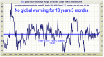
Your WHOLE global warming religious belief system depend on this. I've shown you a graph of the last 18+ years that ABSOLUTELY AND UTTERLY DISPROVES your entire thesis.

You didn't like my graph (probably because it uses actual data), so I'm asking once again to show me a graph that shows that your assertions are true for the last 18+ years. If you can't, then, sorry, it's NOT HAPPENING.
 
Look, I know you're embarrassed that it took you 12 hours to figure out that you replied to a temperature graph with a temperature change graph, but I've moved past that.

You are asserting that:

We ARE seeing rises in temperature, AND we are currently seeing an exponential increase in those rises. Also, it's continuing to happen (as in right now), and it will only continue to get faster.

Your WHOLE global warming religious belief system depend on this. I've shown you a graph of the last 18+ years that ABSOLUTELY AND UTTERLY DISPROVES your entire thesis.

I don't know if you're stupid or just pretending not to know how to correlate two simple graphs, but honestly:

If a graph with a graphical constraint of one degree shows a 0.8 degree temperature change in the last 130 years and you plot that in temperature values within a graphical constraint of 130 degrees and it looks insignificantly small that doesn't negate the fact that you took the data for the temperatures from a graph that shows a 0.8 degree temperature change in the last 130 years.

IN less words: The two graphs both show that:

1. We are seeing rises in temperature
2. The increase is exponential
3. It's continuing to happen.

The only difference between my graph's representation, and yours, is that mine sits within a graphical constraint where the change can be seen without the use of a magnifying glass.

You didn't like my graph (probably because it uses actual data), so I'm asking once again to show me a graph that shows that your assertions are true for the last 18+ years. If you can't, then, sorry, it's NOT HAPPENING.

Your graph is drawn up from THE DATA FROM MY GRAPH FROM GISS!! lol bloody hell, can you really not get this?
 
When you plot a graph with one independent variable and one dependent variable you should:

a) put your independent variable on the x axis and make sure that it is constrained from exactly the lowest value to the highest value if possible, and
b) put your dependent variable on the Y axis making sure that the value range is pertinent for the graph. For instance if the data set for the dependent variable has values ranging from 51.4 to 52.6 then it would be silly to plot the dependent variable on the y axis with a value range from 0 - 130.
 
in the last 130 years

I've said REPEATED the last EIGHTEEN YEARS.

You're assertion, and your whole belief system is that it is HAPPENING NOW.

It's getting worse NOW. It's increasing exponentially NOW.

PLEASE give me a graph that shows all the exponential increase for the LAST 18 YEARS

If you cannot show that it has happened and been happening for the last 18 years, then all your belief systems are wrong.

EDIT: The RSS graph that I posted is the one I'm referring to here, not the GISS stuff.
 
I've said REPEATED the last EIGHTEEN YEARS.

You're assertion, and your whole belief system is that it is HAPPENING NOW.

It's getting worse NOW. It's increasing exponentially NOW.

PLEASE give me a graph that shows all the exponential increase for the LAST 18 YEARS

If you cannot show that it has happened and been happening for the last 18 years, then all your belief systems are wrong.


Graph for increases up to 2015.​ From GISS.


Fig.A3.gif
 
Your graph is drawn up from THE DATA FROM MY GRAPH FROM GISS!! lol bloody hell, can you really not get this?

Now you're just embarrassing yourself. I know when that happens you feel the need to lash out. Of course I know that it was drawn from the data from GISS, It was ME who said that it was actual GISS. And it was you who didn't get it until about 45 minutes ago.

Your actual quotes:

Clearly someone's altered that. Here's the ACTUAL GISS website, with all their graphs.

All these graphs (GISS OFFICIAL GRAPHS) show different trends to the graph you posted

Your graph is INCORRECT. I googled the image and found it on no official site, parituclarly not GISS. Some more from GISS:

Real science isn't about misrepresenting data and the graph isn't from GISS
 
Now you're just embarrassing yourself. I know when that happens you feel the need to lash out. Of course I know that it was drawn from the data from GISS, It was ME who said that it was actual GISS. And it was you who didn't get it until about 45 minutes ago.

Your actual quotes:

Clearly someone's altered that. Here's the ACTUAL GISS website, with all their graphs.

All these graphs (GISS OFFICIAL GRAPHS) show different trends to the graph you posted

Your graph is INCORRECT. I googled the image and found it on no official site, parituclarly not GISS. Some more from GISS:

Real science isn't about misrepresenting data and the graph isn't from GISS

It is incorrect, scientifically and mathematically; it's not an accurate graph. It's misprepresentative of the data, it's not an actual GISS graph (though drawn from there) and its parameters, most importantly, are TOO LARGE to show the actual change in temperature. Look, what are you actually disputing here? Because it feels like you just want to spend time measuring your testicles or something.

The graph shows the planet has warmed in the last 130 years, your graph takes the sample and plots it with constraints too large for the set, and you try to say the planet isn't/hasn't been warming. Well look, we've established that you're wrong about that. It has and is.

I've made my point.
 
Graph for increases up to 2015.​ From GISS.


Fig.A3.gif


Do you think 1880 was just 18 years ago?

How many times do I have to explain this to you. You say it is occurring NOW, and getting worse NOW. So, again:


1. Please show me a graph that proves your assertions
2. Since you insist that it's happening now, please use a graph FOR THE LAST 18 YEARS

You know, like this one, which CLEARLY SHOWS that everything you assert is WRONG:


gw.png

Again, if you don't like this 18 year graph (NOT a 135 year graph - you seem not to get this), then show me another.
 
your graph takes the sample and plots it with constraints too large for the set

That is a great quote, because it shows EXACTLY what you've been doing.

I've been asking for an 18 year graph that shows current warming, and current exponential increases, and you've continued to show me a 130 year graph.

Since your assertions say that all this is occurring NOW, your 130 year graph is TOO LARGE for your assertions.


....he says as he waits for a graph that shows massive increased warming in the last 18 years, a graph that he knows doesn't exist since there has been no temperature increase, exponential or otherwise, for the last 18+ years