Glory to God for Letterheads
- Thread starter PAC-fit
- Start date
-
Christian Chat is a moderated online Christian community allowing Christians around the world to fellowship with each other in real time chat via webcam, voice, and text, with the Christian Chat app. You can also start or participate in a Bible-based discussion here in the Christian Chat Forums, where members can also share with each other their own videos, pictures, or favorite Christian music.
If you are a Christian and need encouragement and fellowship, we're here for you! If you are not a Christian but interested in knowing more about Jesus our Lord, you're also welcome! Want to know what the Bible says, and how you can apply it to your life? Join us!
To make new Christian friends now around the world, click here to join Christian Chat.
You are using an out of date browser. It may not display this or other websites correctly.
You should upgrade or use an alternative browser.
You should upgrade or use an alternative browser.

Yes, after my grabbing my first manual saw three influencers from the 80s. I suspect publishers now have a means to capture public appeal on fonts too.

I sang that one a lot at w*rk. They'd call for stuff and I'd already have it in progress because I read their order board and knew what was coming.I saw the sign
it opened my eyes
I saw the sign
-Ace of Base
"It's down. I saw the sign..."

In the local govt they had official marketing/communications/PR and it was all done in Helvetica/Tahoma or the one we type in on CC
I hand wrote a lot of signage in my school library and then got told off for not using Microsoft Word. The previous librarian was using Comic Sans, but not everything has to be like a cartoon. Comic Sans did not do their a's with a cap and I always wrote them with one.
I hand wrote a lot of signage in my school library and then got told off for not using Microsoft Word. The previous librarian was using Comic Sans, but not everything has to be like a cartoon. Comic Sans did not do their a's with a cap and I always wrote them with one.

The spiral bound Lettering Book was a classic from the 80s for school children doing projects. We needed eye-catching titles and headings.
Not everything was done using stencils, we used tracing paper, which some viewed as 'cheating' because it wasn't freehand.
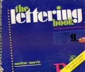
Not everything was done using stencils, we used tracing paper, which some viewed as 'cheating' because it wasn't freehand.
It's a bit too late for me to pursue a career in typography/sign writing but I think I would have loved it.
I became librarian instead where I had entire books of letters to sort, catalogue and shelve. Before computers, we had card catalogues and if you were not typing out your descriptions/annotations you had to write them in very neat, tiny print.
My printed handwriting was always big because I wanted it to be easy to read.
I became librarian instead where I had entire books of letters to sort, catalogue and shelve. Before computers, we had card catalogues and if you were not typing out your descriptions/annotations you had to write them in very neat, tiny print.
My printed handwriting was always big because I wanted it to be easy to read.
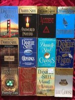
Yes! Now if you had a room-full of big name publishing designers to hold a top-three easy picks for unintrusive allure, what would they top it off with? By unintrusive I mean, legible yet not punchy with a formal touchI love the embossing on the covers of books. If you had a big name author, their name would be above the title, and possibly in silver or gold and embossed.
Check out Danielle Steel
View attachment 293317
Answered Prayers
The Cottage
The Ghost
May be a generational derivative from the first of it's kind, Mistral.
- Designer: Created by renowned French graphic designer Roger Excoffon.
- Release Date: Originally released in 1953 by the Fonderie Olive foundry.
- Characteristics: Modeled directly on Excoffon's own handwriting, Mistral is famous for its natural brush-stroke appearance and the seamless way its lowercase letters connect along a unified baseline.
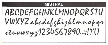
That's like the calligraphic font English people use for Chinese writing.May be a generational derivative from the first of it's kind, Mistral.
View attachment 293346
- Designer: Created by renowned French graphic designer Roger Excoffon.
- Release Date: Originally released in 1953 by the Fonderie Olive foundry.
- Characteristics: Modeled directly on Excoffon's own handwriting, Mistral is famous for its natural brush-stroke appearance and the seamless way its lowercase letters connect along a unified baseline.


Actually, I see a few caps like the A and V share the same fields. But the lower case of Mistral has laid clear claim to it's own.That's like the calligraphic font English people use for Chinese writing.
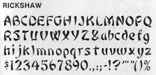
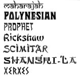

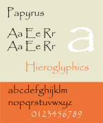
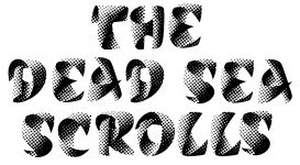
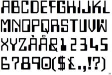
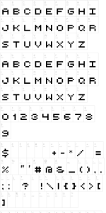
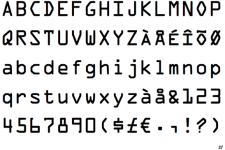
 Good nabs!
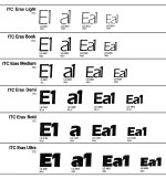
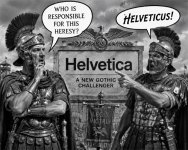
While it is said and widely know, Helvetica is 'the undisputed worldwide champion in corporate and public signage', few will admit if any, the downside of that is everybody wanted on that bandwagon, including your local sanitation trucks in a neighborhood near you. But, at the same time Helvetica peaked (65-75), another did as well just enough to distinguish itself from the giant, Eras. Any good designer worth his salt will tell you why Eras was Helvetica's chief rival in those almost undetectable arching strokes to aid legibility across all weights. But will that designer be able to pick up on the other illusion going on here?