Glory to God for Letterheads
- Thread starter PAC-fit
- Start date
-
Christian Chat is a moderated online Christian community allowing Christians around the world to fellowship with each other in real time chat via webcam, voice, and text, with the Christian Chat app. You can also start or participate in a Bible-based discussion here in the Christian Chat Forums, where members can also share with each other their own videos, pictures, or favorite Christian music.
If you are a Christian and need encouragement and fellowship, we're here for you! If you are not a Christian but interested in knowing more about Jesus our Lord, you're also welcome! Want to know what the Bible says, and how you can apply it to your life? Join us!
To make new Christian friends now around the world, click here to join Christian Chat.
You are using an out of date browser. It may not display this or other websites correctly.
You should upgrade or use an alternative browser.
You should upgrade or use an alternative browser.
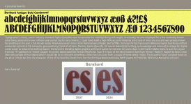

That flavor for all body content has held it's own and will continue for some time, in theory?, , because unlike many of it's challengers, is the least likely to distract. Now for heading titles, (not sure of the NZ Herald) "Times/Roman" or any similar font's only lure is to do just that, grab our attention. My own debut font for headings is on the back burner, but wish to challenge with my design against the old standard, which has for a long long time lacked necessary and polished allurement.Gothic for the NZ Herald newspaper
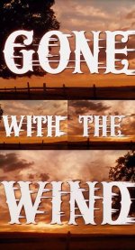
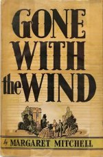
Surprised your "Gone" attempts of serif application is considered all that much more than Bernhard's? Yet, that probably depends on the typeface Foundry director's approval. But, here, the GWTW adaptation of "Romans Bold" into the 1820's "Circus" is brilliant. The direct conscious effect of the conservative stroke elevates Circus well-above it's sideshow origins.


Scripture
What is the one that all products in the Christian bookstore have? You know, the swirly cursive one?
Comic Sans!
No Courier new. I am resolved to be different. I can hear the tap tap tap and click click click of my 9 to 5 job in the steno pool as I type away. Pass the twink...
It's like rain...
On your wedding day...
It's a free ride...
One you already paid
No Courier new. I am resolved to be different. I can hear the tap tap tap and click click click of my 9 to 5 job in the steno pool as I type away. Pass the twink...
It's like rain...
On your wedding day...
It's a free ride...
One you already paid
Got Georgia on my mind..
Left my home in Georgia...heading for the Frisco Bay
I got nothing to live for
Seem nothin' gonna come my way
Hey there Georgie Girl!
Swinging down the sidewalk
So fancy free
Nobody could ever see...
By George!
She's got it!
Georgie Pie. Enough said.
Left my home in Georgia...heading for the Frisco Bay
I got nothing to live for
Seem nothin' gonna come my way
Hey there Georgie Girl!
Swinging down the sidewalk
So fancy free
Nobody could ever see...
By George!
She's got it!
Georgie Pie. Enough said.
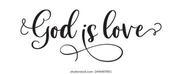
Ah-yes. Some, are absolute gems. Ok, most all are. Their creators between the 60s and 80s gave their renditions out by the gross it seems, looking back. But their variations today hover on the fundamental version of "Commercial Script" 1908. Industry recognized a more standardize need which surfaced based on the earlier "Bank Script".Scripture
What is the one that all products in the Christian bookstore have? You know, the swirly cursive one?

No it's more relaxed that that one, like not so thick on the down stroke. The ones at the Christian bookstore look like they've been penned with more of a fine point rather than a chisel calligraphy pen.Ah-yes. Some, are absolute gems. Ok, most all are. Their creators between the 60s and 80s gave their renditions out by the gross it seems, looking back. But their variations today hover on the fundamental version of "Commercial Script" 1908. Industry recognized a more standardize need which surfaced based on the earlier "Bank Script".
View attachment 293307
Okay, maybe you could describe for me is it more freestyle or still following constraints? But keep in mind, book jacket design is almost always run through a very critical process covering every aspect I'm sure you are aware. Yet, as you say, on multiple covers. If so, maybe you could post an image for me to run down?No it's more relaxed that that one, like not so thick on the down stroke. The ones at the Christian bookstore look like they've been penned with more of a fine point rather than a chisel calligraphy pen.