
Glory to God for Letterheads
- Thread starter PAC-fit
- Start date
-
Christian Chat is a moderated online Christian community allowing Christians around the world to fellowship with each other in real time chat via webcam, voice, and text, with the Christian Chat app. You can also start or participate in a Bible-based discussion here in the Christian Chat Forums, where members can also share with each other their own videos, pictures, or favorite Christian music.
If you are a Christian and need encouragement and fellowship, we're here for you! If you are not a Christian but interested in knowing more about Jesus our Lord, you're also welcome! Want to know what the Bible says, and how you can apply it to your life? Join us!
To make new Christian friends now around the world, click here to join Christian Chat.
You are using an out of date browser. It may not display this or other websites correctly.
You should upgrade or use an alternative browser.
You should upgrade or use an alternative browser.

Garamond, as I recall had it's check in place as far back as I can remember by it's closest rival, Goudy. Especially once fonts are subjected to larger formats. I would be surprised to know CC member Magenta never used Goudy in any of her creations due to it's mega-artsy Roman style. Goudy's original lightweight creation was so well received, He sold it for an astoundingly insignificant $1,500 only to see it (to his objection) grow to become a unquestionable book-jacket go to for years. Why Goudy Extra Extra Bold Ultra never surfaced is beyond me. The Garamond / Goudy comparisons:

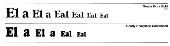
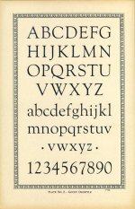
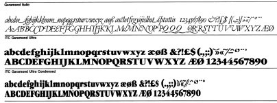
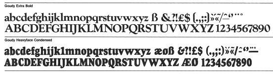

Its the Garfield font!Garamond, as I recall had it's check in place as far back as I can remember by it's closest rival, Goudy. Especially once fonts are subjected to larger formats. I would be surprised to know CC member Magenta never used Goudy in any of her creations due to it's mega-artsy Roman style. Goudy's original lightweight creation was so well received, He sold it for an astoundingly insignificant $1,500 only to see it (to his objection) grow to become a unquestionable book-jacket go to for years. Why Goudy Extra Extra Bold Ultra never surfaced is beyond me. The Garamond / Goudy comparisons:
View attachment 293595
View attachment 293596
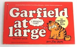
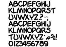
According to Gemini's draw, you win. Although my suspicions were confirmed for my own trade.Its the Garfield font!
View attachment 293604
The Verdict on Visibility
| Metric | Garamond | Goudy |
| Volume of Impressions | Winner. Millions of books, PDFs, and OS defaults. | Lower overall volume; concentrated in display & print design. |
| Visual Recognition | Blends in; designed to be "invisible" to the reader. | Winner. Instantly recognizable display features and letterforms. |
| Historical Range | Renaissance French origins (1500s). | 20th-century American Craftsman movement (1910s). |

These fonts remind me of Cross Stitch samplers ladies used to do in Victorian times
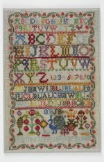


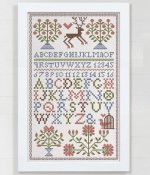
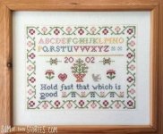
Beautiful! Sorry not to display mine, age behind common glass has taken it down a grayed-out past.
In search of recent history's crowd pleaser, surprise surprise, Baskerville emerged.
Font-Wide Appeal

Font-Wide Appeal
that's a very nice font. Easy on the eyes and clear.In search of recent history's crowd pleaser, surprise surprise, Baskerville emerged.
Font-Wide Appeal
View attachment 293794
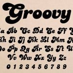
Ah yes, those associated with the 'ad blitz' era of the 1970's remembers it's staple "Candice" font. But not only ads but openings too:

ChatGPT - MyFonts itself describes Candice as being associated with the era's party records and display graphics.
The typographer behind Candice is Alan Meeks (b. 1951), a British type designer whose work is strongly associated with the exuberant display lettering of the 1970s. Candice was designed by Meeks in 1976, originally released through Letraset; it subsequently became part of the ITC library."

A letterhead here in the UK is the sender's address written, typed or printed at the top of a letter. Clearly it means something different on this thread, like a lengthy way of saying "font."
A letterhead here in the UK is the sender's address written, typed or printed at the top of a letter. Clearly it means something different on this thread, like a lengthy way of saying "font."
 Hello sir. You are right, though I wish to incorporate any level of beauty wherever fonts have been placed for mankind with all minimalist handling of original fonts to the creativity from basic letterforms, type has clearly taken it's place in the world's visual enrichment. As far as I can tell, something happened from about 1965 onward. Back in circa '65, two designers were responsible for setting off the designing and customizing craze, Von Dutch and Ed Roth. The graphic design for ads and apparel industries soon followed. By the middle 70's a renewed mindset in design had been unleashed for all walks of image makers.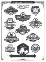
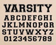
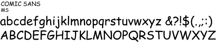

Its the alphabet written by a felt-tip penAs I pointed out in the OP, Adobe, didn't stand by it's longstanding fonts for the non-subscribing (CD-version) era folks. The now lost "Kids" font, left with a less whimsical "Comic Sans" compared to in one of my illustrations,
View attachment 293880
View attachment 293881
Or fingers in the sand