Glory to God for Letterheads
- Thread starter PAC-fit
- Start date
-
Christian Chat is a moderated online Christian community allowing Christians around the world to fellowship with each other in real time chat via webcam, voice, and text, with the Christian Chat app. You can also start or participate in a Bible-based discussion here in the Christian Chat Forums, where members can also share with each other their own videos, pictures, or favorite Christian music.
If you are a Christian and need encouragement and fellowship, we're here for you! If you are not a Christian but interested in knowing more about Jesus our Lord, you're also welcome! Want to know what the Bible says, and how you can apply it to your life? Join us!
To make new Christian friends now around the world, click here to join Christian Chat.
You are using an out of date browser. It may not display this or other websites correctly.
You should upgrade or use an alternative browser.
You should upgrade or use an alternative browser.
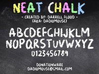


Nice! Irregular edges are soo rare for established font's, designers have to create logos of them on the fly. On your example, the artistic license is especially meaningful. But really, did this designer have to push the envelop that hard with the "U" (email)? So rare, after A.I. searches only Gemini could find me a single established font of a Dry Brush, first based on my sketch as it is most generally a spin-off of existing fonts.
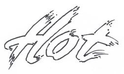
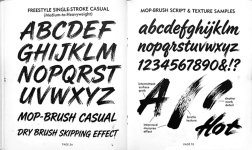
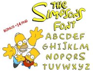
Interesting! No question, liberties were taken in the logo. While the "n" and "s" jumped off the reservation, the flavor was a huge payoff.
Sorry... this one shows the lower case as well.. not too different but notice the n and s and also the e and p
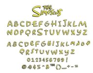
If I was a betting man, I would bet the farm on that final "S" as not being the first one put up by Matt Groening (Logo creator). But, since they wanted the best of both worlds (uniformity / originality), they dumbed-down the top side and drove up the points for balance.Sorry... this one shows the lower case as well.. not too different but notice the n and s and also the e and p
View attachment 294296
"And Groening himself has described his working method as extremely hands-on and rapid: he would draw material on animation paper and expect professional animators to clean it up." - ChatGPT
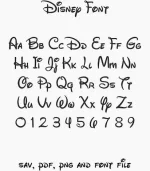
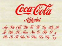
Is it me or do some of these characters seem to assume another font, such as most of the "Z" line? And what happened to the Y? Artistic license noted. Love the A,D,H,P caps.
Un-edited AI output, 2nd request, , Strange stuff, one must pay attention.

It's more
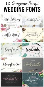
Lovehearts or starlight is commonly used for Christian merch
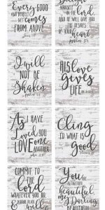
Not sure what font the CAPS parts are
Lovehearts or starlight is commonly used for Christian merch
Not sure what font the CAPS parts are

Have you ever read the Babysitter's Club books?
The OG ones, not the modern reprints
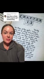
Stacey's handwriting - always had lovehearts as the jots
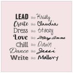
I always thought aspiring author Mallory's wasn't very writerly, and that Claudia, the artistic one who couldn't spell and was kind of dyslexic, wouldn't have had that type of handwriting
Jessis' was a nightmare to read. She was the ballerina.
Everyone wanted to write like sophisticated NYer Stacey, but that would take too long with all the hearts!
Mary Anne's was probably my favourite
Yea Mallory's could have been typewriter font I suppose, but I imagine she would have more of a script similar to Mary Anne's (the secretary)
This was always the chapter's letterhead
An OG BSC book
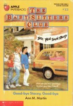
They'd had a yard sale for when Stacey moved back to NY, so possibly accounts for the bedsheet sign. Claudia painted it, although she had to ask Mallory how to spell, also, she created the block font logo for the club, and had to ask her genius older sister Janine whether to include an apostrophe or hyphen for the Baby-sitters
The OG ones, not the modern reprints
Stacey's handwriting - always had lovehearts as the jots
I always thought aspiring author Mallory's wasn't very writerly, and that Claudia, the artistic one who couldn't spell and was kind of dyslexic, wouldn't have had that type of handwriting
Jessis' was a nightmare to read. She was the ballerina.
Everyone wanted to write like sophisticated NYer Stacey, but that would take too long with all the hearts!
Mary Anne's was probably my favourite
Yea Mallory's could have been typewriter font I suppose, but I imagine she would have more of a script similar to Mary Anne's (the secretary)
This was always the chapter's letterhead
An OG BSC book
They'd had a yard sale for when Stacey moved back to NY, so possibly accounts for the bedsheet sign. Claudia painted it, although she had to ask Mallory how to spell, also, she created the block font logo for the club, and had to ask her genius older sister Janine whether to include an apostrophe or hyphen for the Baby-sitters
Well-well, then I assume the author-s knew the power neg/pos letterform?
I prob shouldn't post an example, but that is pretty much my blessed ex's natural handwriting if you could visualize a less italicized with a shade taller, but beautiful Caps and shorter LC (lower-case).Mary Anne's was probably my favourite
My handwriting is like a cross between Stacey's and Dawns print. Staceys 'a' is the way I used to write my a's, until I got a bit lazy and the 'a' ended up looking like 'd's and would confuse people. My script or cursive was most like Claudias except way messier.Well-well, then I assume the author-s knew the power neg/pos letterform?
I prob shouldn't post an example, but that is pretty much my blessed ex's natural handwriting if you could visualize a less italicized with a shade taller, but beautiful Caps and shorter LC (lower-case).
Everyone's handwriting is unique. My dad printed, and my mum only wrote in cursive. My sister could do both, but her cursive was hard to read, my mum could never read it, it was like Kristy's, but smaller. Her print was like Dawns, but much smaller and neater.
I always had big handwriting.
I was taught differently in each year of primary school depending on teacher preference, so had to find my own style. I never became a doctor, so my script didn't totally deteriorate into illegibility as most doctors handwriting does lol . But my signature is a mess. I can never sign my name fast enough to make it legible. I was also cursed with 'S' as the capital letter of my birth name, and that means its not easy to start with, (top right, one stroke and curved) or join in cursive.
I would have much rather had an easier upper case letter...like L!
Calligraphy is an art that is not really taught in schools, handwriting tuition tends to stop at Year 6 before Intermediate/Middle School. Its a shame. I learned to type in Year 9 of High School on electronic typewriters. I learned Shorthand too, but never used it.
If I'd been born before 'word processors' started to take off, and computers, I probably would have learned on a traditional typewriter at school. At least I can touch-type instead of hunting and pecking like most people do but I just hate trying to type on a smartphone or ipad.
My fingers, while slender aren't THAT tiny.
Anyway that's just a modern day gripe. Before smartphones I got quite good at txting with my thumbs.
If I'd been born before 'word processors' started to take off, and computers, I probably would have learned on a traditional typewriter at school. At least I can touch-type instead of hunting and pecking like most people do but I just hate trying to type on a smartphone or ipad.
My fingers, while slender aren't THAT tiny.
Anyway that's just a modern day gripe. Before smartphones I got quite good at txting with my thumbs.
Time, has not been friendly on mine. As the story goes, 'He shook like a leaf till the brush hit the surface.' Same with pen.My handwriting is like a cross between Stacey's and Dawns print. Staceys 'a' is the way I used to write my a's, until I got a bit lazy and the 'a' ended up looking like 'd's and would confuse people. My script or cursive was most like Claudias except way messier.

Now where did you get the idea it was too late? And why not? The tools that have come into being in the last 40-yrs and then, intensified in the last year have quite frankly, drop-kicked the whole visual approach into the stratosphere (finally found a place to put that word, Ha!).It's a bit too late for me to pursue a career in typography/sign writing but I think I would have loved it.
But really, as far as typography goes, the tools in my view should still be hands-on hardcopy on cardstock, vellum or any acid-free paper because there is no such thing as 'working off-line' computer-generated creations. I know, you're still going to have to have a handful of your typestyle examples assembled to present to that prospective Font Foundry, I haven't found a way around that yet, but as for letter-manipulation for signage or, simple Save the Date or Wedding Invitation cards, the common designer at heart anymore doesn't even have to get an academic commitment in hand.
If I was at that point today and would want something to work from once I secured a good AI designer footing, I would suggest a handful of abstract patterns so I could direct my chosen AI design model to follow this or that path. Here are a few I made up if anyone is interested. You can even us them for hand-built lettering contours if you have a light-table. If not, tape them to a window or even flip a large clear baking dish over with a flashlight inside. Just instruct, 'follow contour centered, or to-right'. Feel free to collect a few, ,