Glory to God for Letterheads

  • Christian Chat is a moderated online Christian community allowing Christians around the world to fellowship with each other in real time chat via webcam, voice, and text, with the Christian Chat app. You can also start or participate in a Bible-based discussion here in the Christian Chat Forums, where members can also share with each other their own videos, pictures, or favorite Christian music.

    If you are a Christian and need encouragement and fellowship, we're here for you! If you are not a Christian but interested in knowing more about Jesus our Lord, you're also welcome! Want to know what the Bible says, and how you can apply it to your life? Join us!

    To make new Christian friends now around the world, click here to join Christian Chat.
Who knows, that may well be the medium God writes in - pure gold! Lovely, not sure but the 'Medes and the Persians' likely would agree.
He uses his finger as a pen, just like Jesus did writing in the sand or on the ground (the only writing he did apparently)

God used his finger to write the Ten Commandments in stone.

In China, there is a thing where people write with water using brushes to practice their calligraphy. on the ground. It only lasts on a dry day before it disappears/evaporates.
 
I did ask where the Ark Of Convenant got to (it held the stone tablets containing the ten commandments) but nobody on CC or the Bible Discussion Forum could answer.
 
God used his finger to write the Ten Commandments in stone.
All true. Adding nothing, meaning, Exodus 31:18 states,"written with the finger of God." and Deuteronomy 9:10 reiterates.
He uses his finger as a pen
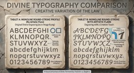
Your welcome to that, but how sure is it. It would not be true to if we are made in His image, if I were to pass my finger unfettered by solid rock and without the backfill of sand as what Jesus likely experienced. But, that becomes problematic for me, for He is both perfect yet, also THE perfect Creator. It would likely have to fall somewhere between line-perfect and artistic flare on the use of Monoline Round-stroke. In Hebrew I suspect.

Monoline Round-Stroke.jpg
 
I did ask where the Ark Of Convenant got to (it held the stone tablets containing the ten commandments) but nobody on CC or the Bible Discussion Forum could answer.
Admittingly, I am just a fallible temple of clay to address such intensity. This appears convincing to me.
 
All true. Adding nothing, meaning, Exodus 31:18 states,"written with the finger of God." and Deuteronomy 9:10 reiterates.

Your welcome to that, but how sure is it. It would not be true to if we are made in His image, if I were to pass my finger unfettered by solid rock and without the backfill of sand as what Jesus likely experienced. But, that becomes problematic for me, for He is both perfect yet, also THE perfect Creator. It would likely have to fall somewhere between line-perfect and artistic flare on the use of Monoline Round-stroke. In Hebrew I suspect.

View attachment 295732
Well fingers are rarely perfectly round. They also have nails at the end.
It would be like writing in concrete before it sets, or pressing in soft clay, but He wouldn't have used print blocks.
 
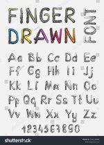
images-25.jpg

It would have had to be clear and readable for the Hebrews to follow, so something like this but in stone. God's handwriting would be perfect but also clear that was His hand and not anyone else's. If they were to make copies of the commandments/tablets, they would have done a rubbing with paper/parchment.
 
Hebrew equivalent I don't know if it has upper and lower case, but commandments I reckon would be all in uppercase and in bold!

THOU SHALT NOT

not thou shalt not....
 
which is?
You link just goes to a chat GPT website.
Chuck-full of truth.
I did ask where the Ark Of Convenant got to (it held the stone tablets containing the ten commandments) but nobody on CC or the Bible Discussion Forum could answer.
"Jeremiah 3:16 says that a future generation will reach a point where: “they shall say no more, The ark of the covenant of the LORD... neither shall it come to mind: neither shall they remember it; neither shall they visit it; neither shall that be done any more.”" ChatGPT
That precise time is the question! Now, since God is not the author of confusion, at what point today is the overburden of proof set for either? Furthermore, if it "comes to mind", is the memory of it dependent on a fascination of the mind, or what may be the causation of a living God?
 
Chuck-full of truth.


That precise time is the question! Now, since God is not the author of confusion, at what point today is the overburden of proof set for either? Furthermore, if it "comes to mind", is the memory of it dependent on a fascination of the mind, or what may be the causation of a living God?
Well Jeremiah as well as all those prophets (of doom) were trying to warn Israel about what would happen when they forgot God and His covenant.
Also the temple would be vacated and destroyed and their worship would be in vain, it would all be for show, because God had left it.

Thankfully some people had copied what was written down and kept some of it preserved in written form i.e scripture like the dead sea scrolls. But the original had long gone and the only people with access would have been the scribes and the Pharisees.
 
Also what they had remember as oral tradition was strong amongst the Hebrews. Literacy is still strong, like Israelis have something like 99% literacy - everyone can read and write.

This is not so amongst other peoples of the world. You would be surprised at the amount of people who can't read, or only pretend to, and rely on others to read for them.
 
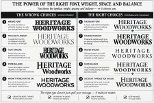
Often, "Typefaces/fonts matter and how typographers actually use them.

An Ideal Top-Twenty: Facts That Point to the Use of Fonts in Typography​

  1. A typeface is the design; a font is its usable implementation.
    Historically, a typeface was the family/design, while a font was a particular size and style of that design. Digital typography has blurred that distinction considerably.
  2. Typography is not simply the selection of attractive letters.
    It is the deliberate arrangement of type to communicate language, hierarchy, tone, rhythm, and visual structure.
  3. Every typeface carries a visual voice.
    Serif, sans serif, grotesque, humanist, geometric, script, blackletter, display, and other categories create different expectations before a word is even read.
  4. Letterform proportion profoundly affects readability.
    X-height, character width, stroke contrast, counters, ascenders, descenders, and spacing all influence how easily text can be read.
  5. Size changes the behavior of a typeface.
    A design that performs beautifully at 8–10 points may become inappropriate at 72 points—and vice versa. Historically, type was often cut specifically for different sizes.
  6. Weight is a typographic tool, not merely decoration.
    Light, book, regular, medium, semibold, bold, extra bold, and black weights allow a designer to establish hierarchy and emphasis without changing the basic letterform vocabulary.
  7. Width provides another dimension of typographic control.
    Condensed, normal, and extended versions can dramatically alter the amount of information occupying a given space.
  8. Spacing is part of the typeface's design language.
    Tracking, kerning, word spacing, and line spacing can make identical letters appear either elegant and controlled or crowded and amateurish.
  9. Kerning exists because letters do not occupy visual space according to their rectangular boundaries.
    The classic A–V, T–o, W–a, and similar combinations demonstrate why mechanical equal spacing is insufficient.
  10. Typography operates through hierarchy.
    Size, weight, width, position, capitalization, spacing, and typeface selection allow the reader to recognize titles, subtitles, captions, body copy, notes, and emphasis almost instantly.
  11. Display typography permits considerably more expressive freedom than text typography.
    A spectacular face that would be exhausting in a page of body copy may be extraordinarily effective on a poster, sign, package, headline, or title.
  12. The physical medium influences type selection.
    Newspaper printing, book printing, signage, vinyl lettering, engraving, screen printing, digital displays, and large-format graphics impose different requirements on letterforms.
  13. Historical typefaces often encode the technology of their era.
    Metal type, wood type, phototype, Letraset, PostScript, TrueType, OpenType, and variable fonts each changed what typographers could practically do.
  14. A typeface can become culturally recognizable independent of its words.
    Certain letterforms become strongly associated with particular periods, industries, institutions, advertising styles, or visual movements.
  15. Typography depends upon context.
    The “right” typeface for a Victorian circus poster, corporate identity, newspaper, gravestone, children's book, architectural drawing, or luxury invitation may be completely different.
  16. Contrast between typefaces can establish visual authority.
    Pairing a strong display face with a quieter text face—or a serif with a compatible sans—can create hierarchy without resorting to excessive ornament.
  17. Too many typefaces usually destroy hierarchy rather than improve it.
    Skilled typography often obtains considerable variety from a single family through changes in size, weight, width, capitalization, spacing, and placement.
  18. Typography has a physical rhythm.
    Repeated stems, curves, counters, diagonals, ascenders, descenders, and spaces create patterns that the eye perceives almost like musical rhythm.
  19. Exceptional typography is often recognized by what has been restrained.
    Good typography does not merely display the typeface; it allows the typeface to perform its communicative function without unnecessary interference.
  20. The ultimate purpose of typography is controlled communication through visual form.
    The typographer manipulates letterforms, spacing, scale, weight, proportion, placement, and contrast so that meaning and visual character reinforce one another.
And there is one fact I would put almost outside the twenty because it gets to the heart of your own background as a sign man:

A typeface is not merely a collection of letters; it is a system of relationships among letters.

That distinction is especially important in hand lettering and outdoor advertising. A typographer who understands only individual characters can reproduce a font. Someone who understands the relationships can make the entire word, line, or composition appear as though it was conceived as one visual object.

That is also why an experienced sign painter can sometimes look at a digitally typeset word and immediately sense that something is wrong even when every individual letter is technically correct. The problem is often rhythm, spacing, proportion, optical alignment, or the interaction of neighboring forms—not the letters themselves." - ChatGPT