A conversation about nothing in particular
- Thread starter HisUnfailingLove
- Start date
-
Christian Chat is a moderated online Christian community allowing Christians around the world to fellowship with each other in real time chat via webcam, voice, and text, with the Christian Chat app. You can also start or participate in a Bible-based discussion here in the Christian Chat Forums, where members can also share with each other their own videos, pictures, or favorite Christian music.
If you are a Christian and need encouragement and fellowship, we're here for you! If you are not a Christian but interested in knowing more about Jesus our Lord, you're also welcome! Want to know what the Bible says, and how you can apply it to your life? Join us!
To make new Christian friends now around the world, click here to join Christian Chat.
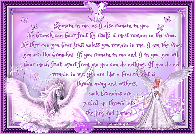
Like this?
(I changed the font, too
BWA HA HA I just realized this is not the one you asked me to change
No wonder the font took up more space than I thought it should LOL
^^ That is the one that I was most recently working on
-
2
-
1
- Show all
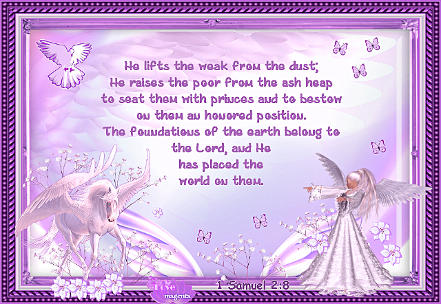
^^ Original, and below, with changes as requested by Becc
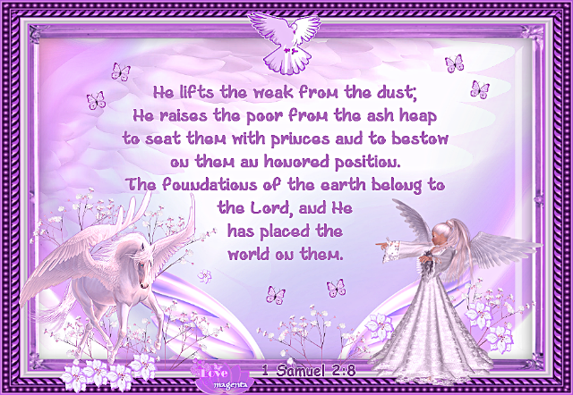
Can you tell that the background is an angel wing?
-
2
-
1
- Show all

^^ Original, and below, with changes as requested by Becc

Can you tell that the background is an angel wing?
-
5
-
2
- Show all
I think she should turn the butterflies into TIE fighters. 


Where are the TIE fighters?? 
Do I want to know? No, probably not
-
4
-
3
- Show all
Nope cuz ur foreground and background are pretty much the same color.. If you have a LIGHT foreground, you need to use a DARK background, and vice versa. Otherwise it all blends together and what SHOULD stand out, doesn't.. Like for instance, I can just barely make out the "love Magenta" and the chapter and verse at the bottom.
And now my "G" key is starting to act up, too
-
3
-
1
- Show all
I just realized actually... nice
-
2
-
2
- Show all
I swear all the products at Walmart, are like, factory seconds that just didn't make the cut but they still try to sell them anyway.. I've been unlucky enough to buy defective products there, from coffee makers to radios to fans.. lol
-
4
-
2
-
2
- Show all
I do not know what TIE fighters are 


Do I want to know? No, probably not
Do I want to know? No, probably not

-
2
-
1
-
1
- Show all
L
Where is every one? this is my new favourite font cuz some of the words look exactly like my real handwriting
Becc hows your studying going?
-
3
-
2
-
1
- Show all
L
L
B


