We have been lied to about Global Warming, but WHY?

  • Christian Chat is a moderated online Christian community allowing Christians around the world to fellowship with each other in real time chat via webcam, voice, and text, with the Christian Chat app. You can also start or participate in a Bible-based discussion here in the Christian Chat Forums, where members can also share with each other their own videos, pictures, or favorite Christian music.

    If you are a Christian and need encouragement and fellowship, we're here for you! If you are not a Christian but interested in knowing more about Jesus our Lord, you're also welcome! Want to know what the Bible says, and how you can apply it to your life? Join us!

    To make new Christian friends now around the world, click here to join Christian Chat.
it is predicted they will be completely gone within 15 years if the current climate warming trend continues.
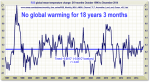
Actually, it was predicted that the glaciers would disappear in 15 years TWENTY YEARS AGO. Yet another failed global warming prediction.

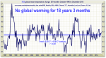
And about that 'current climate warming trend' you speak of, as of December 2014, there has been NO warming AT ALL for 18 years and 3 months.

gw.png
 
A Skeptical Science peer-reviewed survey of all (over 12,000) peer-reviewed abstracts on the subject 'global climate change' and 'global warming' published between 1991 and 2011 (Cook et al. 2013) found that over 97% of the papers taking a position on the subject agreed with the consensus position that humans are causing global warming.

Yet another WIDELY DEBUNKED study STILL being pushed by the global warming zealots. I could give you a thousand links explaining what's wrong with Cook, et al, but maybe you'd rather hear it from an actual scientist who was actually cited in Cook, et al:

Cook and his colleagues, for example, classified a peer-reviewed paper by scientist Craig Idso as explicitly supporting the ‘consensus’ position on global warming “without minimizing” the asserted severity of global warming. When Popular Technology asked Idso whether this was an accurate characterization of his paper, Idso responded, “That is not an accurate representation of my paper.

That doesn't sound very sciency to me.
 
Incase you don't watch; the ice has gone down by more than half in 20 years, from over 4 million sq km to less than 2 million sq km.
Once again, here is another great example of how the global warming religion uses misleading facts. A lot of times they do it intentionally (because their models are failing them); but in this case I'm going to give you the benefit of the doubt and say you did it unknowingly.

The question is, why would do they use only Arctic sea ice??? If it's global warming, the amount of Arctic sea ice doesn't matter, it's the amount of global sea ice. But why oh why would they ever do something like that?

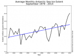
Hey, I think I know, here's a graph of the Antarctic sea ice extent, as measured by satellite since 1979:

gw2.png

And here's the clincher the basically sums up all the GW bullcrap:

“It’s not expected,” says Professor John Turner, a climate expert at the British Antarctic Survey. “The world’s best 50 models were run and 95% of them have Antarctic sea ice decreasing over the past 30 years.”

Yep, a climate EXPERT
Yep, 95%
Yep, the BEST models
 
Annually, worldwide, oil companies receive about £775billion in subsidies.
Cmon guy, this beyond absurd even for a climate extremist! ( I know most leftists consider ANY tax cut a gov. subsidy, because they don't believe that anyone's income is ALL theirs to begin with, and it's all really the govs. to begin with, but a tax cut merely let's people/corps keep more of THEIR OWN money!)

ExxonMobile by itself paid over $41 billion in taxes last year. And remember, if you calculate what CONSUMERS pay to the government on fossil fuel taxes the number is astronomical.

Please tell me how much tax revenue Solar, wind, and fairy dust has contibuted to gov coffers?

Companies Paying the Most (and Least) Taxes - ExxonMobil Corp (NYSE:XOM) - 24/7 Wall St.
 
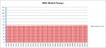
Here's my favorite graph, which shows global average temperatures since 1880.

Fair warning, the MASSIVE warming trend is MUCH WORSE than we ever imagined:

gw3.jpg

The word you're looking for is 'perspective'.
 
Here's my favorite graph, which shows global average temperatures since 1880.

Fair warning, the MASSIVE warming trend is MUCH WORSE than we ever imagined:

View attachment 97652

The word you're looking for is 'perspective'.

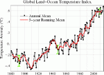
Clearly someone's altered that. Here's the ACTUAL GISS website, with all their graphs.
http://data.giss.nasa.gov/gistemp/graphs_v3/

The UK Met Office

Global surface temperature - Met Office

The NOAA.

Arctic Change: Global - Global Temprature Trends


All these graphs (GISS OFFICIAL GRAPHS) show different trends to the graph you posted.
 
Clearly someone's altered that. Here's the ACTUAL GISS website, with all their graphs.

When I posted after that graph "The word you're looking for is 'perspective'", I wrote it not for that post, but for your post that followed.

The graph that I posted are the ACTUAL GLOBAL TEMPERATURES since 1880.

The links you shared, as far as I can tell (I didn't read everything on every page), do not show actual global temperatures (nor do they purport to).

Here's how the global warming religion works
1. Hey, let's make a bunch of scary looking graphs
2. But we can't, because if they really examine what the graphs say, they'll no longer believe
3. Don't worry, if they believe in global warming, they certainly don't know what the graphs say

So, that's where you're at, you don't know what the graphs say. I'd like to help you out, but you're more likely to learn and retain if you find out on your own. But, here's an example (the first graph on the first page you sent me to):

gw4.gif

1. Since I didn't study it, I have no reason to believe the above graph isn't correct (besides the obviously decades long fiddling)
2. Just because this graph may be correct, it does not mean that my graph is not correct.

Figure out why, and then we'll talk. The word you're looking for is 'perspective'.
 
What's truly sad is that warmists accuse others of "altering the data" while believing in a "science" that isn't afraid to rely on wild-haired conjecture, scare tactics, and it's own altered or incomplete data -- the last of which can be proven just by going back into the archives for the last 30 years and examined for one's self. If they have to lie, it ain't science.
 
When I posted after that graph "The word you're looking for is 'perspective'", I wrote it not for that post, but for your post that followed.

The graph that I posted are the ACTUAL GLOBAL TEMPERATURES since 1880.

The links you shared, as far as I can tell (I didn't read everything on every page), do not show actual global temperatures (nor do they purport to).

Here's how the global warming religion works
1. Hey, let's make a bunch of scary looking graphs
2. But we can't, because if they really examine what the graphs say, they'll no longer believe
3. Don't worry, if they believe in global warming, they certainly don't know what the graphs say

So, that's where you're at, you don't know what the graphs say. I'd like to help you out, but you're more likely to learn and retain if you find out on your own. But, here's an example (the first graph on the first page you sent me to):

View attachment 97669

1. Since I didn't study it, I have no reason to believe the above graph isn't correct (besides the obviously decades long fiddling)
2. Just because this graph may be correct, it does not mean that my graph is not correct.

Figure out why, and then we'll talk. The word you're looking for is 'perspective'.


Global Annual Mean Surface Air Temperature Change


Line plot of global mean land-ocean temperature index, 1880 to present, with the base period 1951-1980. The dotted black line is the annual mean and the solid red line is the five-year mean. The green bars show uncertainty estimates. [This is an update of Fig. 9a inHansen et al. (2010).]
Figure also available as PDF, or Postscript. Also available are tabular data.


Your graph is INCORRECT. I googled the image and found it on no official site, parituclarly not GISS. Some more from GISS:

gistemp_nino_100.jpg
 
Last edited:
Regardless, even if the temperature change is small, you can make anything look small when you zoom out enough. The point is, the temperature rise we see is an exponential increase. Yes, it's by approximately one degree so far. So what? It's an accumulative problem, with an exponential increase, and that increase will get faster, and that one degree already has huge consequences for global climate.
What you present (if even the true figure) is like looking at the Eiffel Tower from the ground, seeing its size and then zooming out to space and saying ''ahh there's no Eiffel Tower!''

It exists, like global warming.
 
Your graph is INCORRECT. I googled the image and found it on no official site, parituclarly not GISS. Some more from GISS

WRONG again. The graph IS correct. The fact that you don't know WHY it's correct tells me a lot. I need to know that you understand what you did wrong here, so please tell me that you understand.

And yes, you won't be able to find the graph on GISS, because it's not from there. However, the DATA used to create the graph IS from GISS. Specifically, from here:

http://data.giss.nasa.gov/gistemp/tabledata_v3/GLB.Ts+dSST.txt

You see, real science takes the data and graphs the data.
Fake science takes the data, changes it (ALWAYS upwards, btw), and then graphs the fake data.

But that last bit doesn't really have anything to do with why you're wrong about my graph being incorrect. It ABSOLUTELY is correct, but it just appears that you don't know why yet.
 
About twenty-five years ago this bunch was yelling about a new ice age...now the same bunch is crying about global warming...its clear these folks just make-up nonsense from time to time.
 
WRONG again. The graph IS correct. The fact that you don't know WHY it's correct tells me a lot. I need to know that you understand what you did wrong here, so please tell me that you understand.

And yes, you won't be able to find the graph on GISS, because it's not from there. However, the DATA used to create the graph IS from GISS. Specifically, from here:

http://data.giss.nasa.gov/gistemp/tabledata_v3/GLB.Ts+dSST.txt

You see, real science takes the data and graphs the data.
Fake science takes the data, changes it (ALWAYS upwards, btw), and then graphs the fake data.

But that last bit doesn't really have anything to do with why you're wrong about my graph being incorrect. It ABSOLUTELY is correct, but it just appears that you don't know why yet.

Real science isn't about misrepresenting data and the graph isn't from GISS. The graph you've shown me is what's called a misleading inference. You infer global warming is insignificant because you have ''zoomed out'' the graphing data to a point where it shows no discernible variation in global temperature, the result of which is to falsely discredit climate change as a hoax when in fact the data exists, the mean variation in temperature exists, the temperature is on an exponential upward increase, CO2 is the main antagonist for that temperature increase, the temperature increase is outside natural variance and the temperature increase has substantive consequences for the Earth's climate.

What you've posted is dishonest science, that's why you couldn't have got that particular graph from GISS.
 
Last edited:
Regardless, even if the temperature change is small, you can make anything look small when you zoom out enough. The point is, the temperature rise we see is an exponential increase It's an accumulative problem, with an exponential increase, and that increase will get faster, and that one degree already has huge consequences for global climate.

So, you say, global warming IS happening, eh? And you say that 'you can make anything look small when you zoom out enough'
Please refer to this graph:


gw.png

​
Since this graph is for the CURRENT 18+ years, it appears that it is you who is zooming out to show what you want to show. Also, please show me on this graph where the 'exponential increase' is. And show me where the increase is getting faster. Again, you say that global warming IS happening, and that the increase will get faster. The only way you can even begin to believe that is if you ignore the LAST 18+ YEARS OF ACTUAL DATA.

And then there's this:

and that one degree already has huge consequences for global climate

Oh, list some of those consequences for me.

Now, I'm almost sure that you'll go to your favorite global warming religion site and come back with yet more stuff that is easily debunked. But I'm running out of time. I see you game. You post untrue things hoping the uninformed will believe them. Then, when challenged with facts, you just move on to the next thing. Here's some examples:

1. You showed us a graph of Arctic Sea Ice. I educated you that you needed to look at GLOBAL sea ice. You never mentioned it again
2. You gave the imfamous 97% claim. I gave you a direct quote PROVING that they misrepresented scientists. You never mentioned it again.
3. I give you a graph that correctly shows average global temperatures since 1880, and you CONTINUE to post graphs in various time frames that DO NOT show average global temperatures.

Please try harder.
 
Real science isn't about misrepresenting data and the graph isn't from GISS. The graph you've shown me is what's called a misleading inference. You infer global warming is insignificant because you have ''zoomed out'' the graphing data to a point where it shows no discernible variation in global temperature, the result of which is to falsely discredit climate change as a hoax when in fact the data exists, the mean variation in temperature exists, the temperature is on an exponential upward increase, CO2 is the main antagonist for that temperature increase, the temperature increase is outside natural variance and the temperature increase has substantive consequences for the Earth's climate.

What you've posted is dishonest science, that's why you couldn't have got that particular graph from GISS.

Wow. You still don't know what you're missing do you?? It's funny actually, you're trying to have a discussion where you supposedly can show me that you understand the science better than I, and you don't even understand the parameters.

You don't even know what you don't know, and that's par for the course for the global warming religious.
 
So, you say, global warming IS happening, eh? And you say that 'you can make anything look small when you zoom out enough'
Please refer to this graph:
Since this graph is for the CURRENT 18+ years, it appears that it is you who is zooming out to show what you want to show. Also, please show me on this graph where the 'exponential increase' is. And show me where the increase is getting faster. Again, you say that global warming IS happening, and that the increase will get faster. The only way you can even begin to believe that is if you ignore the LAST 18+ YEARS OF ACTUAL DATA.

And then there's this:

and that one degree already has huge consequences for global climate

Oh, list some of those consequences for me.

Now, I'm almost sure that you'll go to your favorite global warming religion site and come back with yet more stuff that is easily debunked. But I'm running out of time. I see you game. You post untrue things hoping the uninformed will believe them. Then, when challenged with facts, you just move on to the next thing. Here's some examples:

1. You showed us a graph of Arctic Sea Ice. I educated you that you needed to look at GLOBAL sea ice. You never mentioned it again
2. You gave the imfamous 97% claim. I gave you a direct quote PROVING that they misrepresented scientists. You never mentioned it again.
3. I give you a graph that correctly shows average global temperatures since 1880, and you CONTINUE to post graphs in various time frames that DO NOT show average global temperatures.

Please try harder.

Here's a scientific paper that debunks your assertions. Looking at surface air temperature only (as per your graph) misses about 90% of the climate data for warming, even if that graph is accurate (which I doubt).

http://www.pas.rochester.edu/~douglass/papers/PLA_21192_proofs_plusFigs1_2.pdf

Read that, please. A snippet:

There has been considerable interest in whether Earth has beenwarming or cooling in recent years. Many studies show that theglobally averaged surface temperature has been “flat” or decreasingsince 1998. For example, in a recent study Kaufmann et al. [1] state“. . . global surface temperatures did not rise between 1998 and2008”. Using surface temperature as the best indicator of warminghas been questioned by Pielke [2,3], who says “Unlike temperatureat some specific depth in the ocean or height in the atmosphere,where there is a time lag in its response to radiative forcing,no time lags are associated with heat changes, since the actualamount of heat present at any time is accounted for. Moreover,because the surface temperature is a massless two-dimensionalglobal field while heat content involves mass, the use of surfacetemperature as a monitor of climate change is not accurate forevaluating heat storage changes” [3]. In our treatment, this takesthe following form: ocean heat content (OHC) has a direct relationshipto Earth’s radiation budget, whereas surface temperature doesnot. In paper [4] we quantified this relationship and tentativelyidentified three recent abrupt changes in the implied radiation imbalance.We argued that each of these changes was correlated witha climate shift (CS) that had been identified independently
 
the temperature is on an exponential upward increase
The word 'is' means that you are saying that the temperature CURRENTLY is on an exponential upward increase. As the 18+ year graph shows, that is ABSOLUTELY FALSE.

the graph isn't from GISS

I've already given you the ACTUAL DATA FROM GISS. It is THEIR DATA. It would be 'dishonest science' if someone plotted the GISS data incorrectly (see Mann, Michael), but you've yet to allege that. Why do you guys have so much trouble accepting YOUR VERY OWN DATA?

CO2 is the main antagonist for that temperature increase
Really?? CO2 has increased greatly in the last 18+ years, but temperatures have remained flat. So, please explain to me why CO2 has increased substantially, but temps remain flat. (but don't bother trying too hard, there's now a list of at least 108 DIFFERENT explanations from the 'consensus').
 
the temperature is on an exponential upward increase
The word 'is' means that you are saying that the temperature CURRENTLY is on an exponential upward increase. As the 18+ year graph shows, that is ABSOLUTELY FALSE.

Mean surface air temperature at a given point does not account for the entire global mean temperature, however, air surface temperature, as per the data when zoomed in, is on a small increase (relative to seas and such) as I showed from past graphs.

the graph isn't from GISS

I've already given you the ACTUAL DATA FROM GISS. It is THEIR DATA. It would be 'dishonest science' if someone plotted the GISS data incorrectly (see Mann, Michael), but you've yet to allege that. Why do you guys have so much trouble accepting YOUR VERY OWN DATA?

It is their data, misrepresented by reframing the focus out from the frame in which it shows actual variation. It is rendered unreadable to any discernable degree as an effort to tranquilize the usefulness of the graph. It's dishonest. If it had been what GISS, as climate scientists, decided represented the data, they'd have represented it as such. It took for someone else to do it, who clearly isn't a climate scientist.

CO2 is the main antagonist for that temperature increase
Really?? CO2 has increased greatly in the last 18+ years, but temperatures have remained flat. So, please explain to me why CO2 has increased substantially, but temps remain flat. (but don't bother trying too hard, there's now a list of at least 108 DIFFERENT explanations from the 'consensus').

Again, surface air temperature represents less than 10% of applicable temperature data. Basing your conclusions on surface air temperature alone is kind of like having a computer with half a screen, no hard drive and a rock for a mouse. You're only seeing a small amount of the picture and it isn't useful in determining whether or not a global temperature shift is happening. Look at sea temperatures near the surface and in deep ocean. Look at stratospheric and atmospheric readings. Look at rainfall, sea levels, and all the rest of the data.
 
Last edited:
