
Annually, worldwide, oil companies receive about £775billion in subsidies.
it all boils down to the money, boys.. it's all about the Benjamins.. :/

Annually, worldwide, oil companies receive about £775billion in subsidies.
it is predicted they will be completely gone within 15 years if the current climate warming trend continues.
A Skeptical Science peer-reviewed survey of all (over 12,000) peer-reviewed abstracts on the subject 'global climate change' and 'global warming' published between 1991 and 2011 (Cook et al. 2013) found that over 97% of the papers taking a position on the subject agreed with the consensus position that humans are causing global warming.
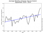
Incase you don't watch; the ice has gone down by more than half in 20 years, from over 4 million sq km to less than 2 million sq km.

Annually, worldwide, oil companies receive about £775billion in subsidies.
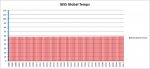
Here's my favorite graph, which shows global average temperatures since 1880.
Fair warning, the MASSIVE warming trend is MUCH WORSE than we ever imagined:
View attachment 97652
The word you're looking for is 'perspective'.
Clearly someone's altered that. Here's the ACTUAL GISS website, with all their graphs.
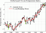
When I posted after that graph "The word you're looking for is 'perspective'", I wrote it not for that post, but for your post that followed.
The graph that I posted are the ACTUAL GLOBAL TEMPERATURES since 1880.
The links you shared, as far as I can tell (I didn't read everything on every page), do not show actual global temperatures (nor do they purport to).
Here's how the global warming religion works
1. Hey, let's make a bunch of scary looking graphs
2. But we can't, because if they really examine what the graphs say, they'll no longer believe
3. Don't worry, if they believe in global warming, they certainly don't know what the graphs say
So, that's where you're at, you don't know what the graphs say. I'd like to help you out, but you're more likely to learn and retain if you find out on your own. But, here's an example (the first graph on the first page you sent me to):
View attachment 97669
1. Since I didn't study it, I have no reason to believe the above graph isn't correct (besides the obviously decades long fiddling)
2. Just because this graph may be correct, it does not mean that my graph is not correct.
Figure out why, and then we'll talk. The word you're looking for is 'perspective'.


Your graph is INCORRECT. I googled the image and found it on no official site, parituclarly not GISS. Some more from GISS
WRONG again. The graph IS correct. The fact that you don't know WHY it's correct tells me a lot. I need to know that you understand what you did wrong here, so please tell me that you understand.
And yes, you won't be able to find the graph on GISS, because it's not from there. However, the DATA used to create the graph IS from GISS. Specifically, from here:
http://data.giss.nasa.gov/gistemp/tabledata_v3/GLB.Ts+dSST.txt
You see, real science takes the data and graphs the data.
Fake science takes the data, changes it (ALWAYS upwards, btw), and then graphs the fake data.
But that last bit doesn't really have anything to do with why you're wrong about my graph being incorrect. It ABSOLUTELY is correct, but it just appears that you don't know why yet.
Regardless, even if the temperature change is small, you can make anything look small when you zoom out enough. The point is, the temperature rise we see is an exponential increase It's an accumulative problem, with an exponential increase, and that increase will get faster, and that one degree already has huge consequences for global climate.
Real science isn't about misrepresenting data and the graph isn't from GISS. The graph you've shown me is what's called a misleading inference. You infer global warming is insignificant because you have ''zoomed out'' the graphing data to a point where it shows no discernible variation in global temperature, the result of which is to falsely discredit climate change as a hoax when in fact the data exists, the mean variation in temperature exists, the temperature is on an exponential upward increase, CO2 is the main antagonist for that temperature increase, the temperature increase is outside natural variance and the temperature increase has substantive consequences for the Earth's climate.
What you've posted is dishonest science, that's why you couldn't have got that particular graph from GISS.
So, you say, global warming IS happening, eh? And you say that 'you can make anything look small when you zoom out enough'
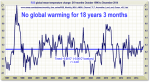
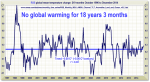
Please refer to this graph:
Since this graph is for the CURRENT 18+ years, it appears that it is you who is zooming out to show what you want to show. Also, please show me on this graph where the 'exponential increase' is. And show me where the increase is getting faster. Again, you say that global warming IS happening, and that the increase will get faster. The only way you can even begin to believe that is if you ignore the LAST 18+ YEARS OF ACTUAL DATA.
And then there's this:
and that one degree already has huge consequences for global climate
Oh, list some of those consequences for me.
Now, I'm almost sure that you'll go to your favorite global warming religion site and come back with yet more stuff that is easily debunked. But I'm running out of time. I see you game. You post untrue things hoping the uninformed will believe them. Then, when challenged with facts, you just move on to the next thing. Here's some examples:
1. You showed us a graph of Arctic Sea Ice. I educated you that you needed to look at GLOBAL sea ice. You never mentioned it again
2. You gave the imfamous 97% claim. I gave you a direct quote PROVING that they misrepresented scientists. You never mentioned it again.
3. I give you a graph that correctly shows average global temperatures since 1880, and you CONTINUE to post graphs in various time frames that DO NOT show average global temperatures.
Please try harder.
the temperature is on an exponential upward increase
The word 'is' means that you are saying that the temperature CURRENTLY is on an exponential upward increase. As the 18+ year graph shows, that is ABSOLUTELY FALSE.
the graph isn't from GISS
I've already given you the ACTUAL DATA FROM GISS. It is THEIR DATA. It would be 'dishonest science' if someone plotted the GISS data incorrectly (see Mann, Michael), but you've yet to allege that. Why do you guys have so much trouble accepting YOUR VERY OWN DATA?
CO2 is the main antagonist for that temperature increase
Really?? CO2 has increased greatly in the last 18+ years, but temperatures have remained flat. So, please explain to me why CO2 has increased substantially, but temps remain flat. (but don't bother trying too hard, there's now a list of at least 108 DIFFERENT explanations from the 'consensus').